Following on from last week’s topic of the fallacy of gold being a great inflationary hedge, this week I would like to take a look at the price of gold compared to the price of stocks. As we discussed last week, there are many in the investing community who believe that an investment in gold is an ideal hedge against inflation. Last week, we saw how this is not really so.
What really interests me though, as a share trader and investor, is the comparison between the gold price and the overall prices of stocks. Looking at the charts below, it is pretty clear to see that the long term performance of stocks and shares is far superior to a long term investment in gold.
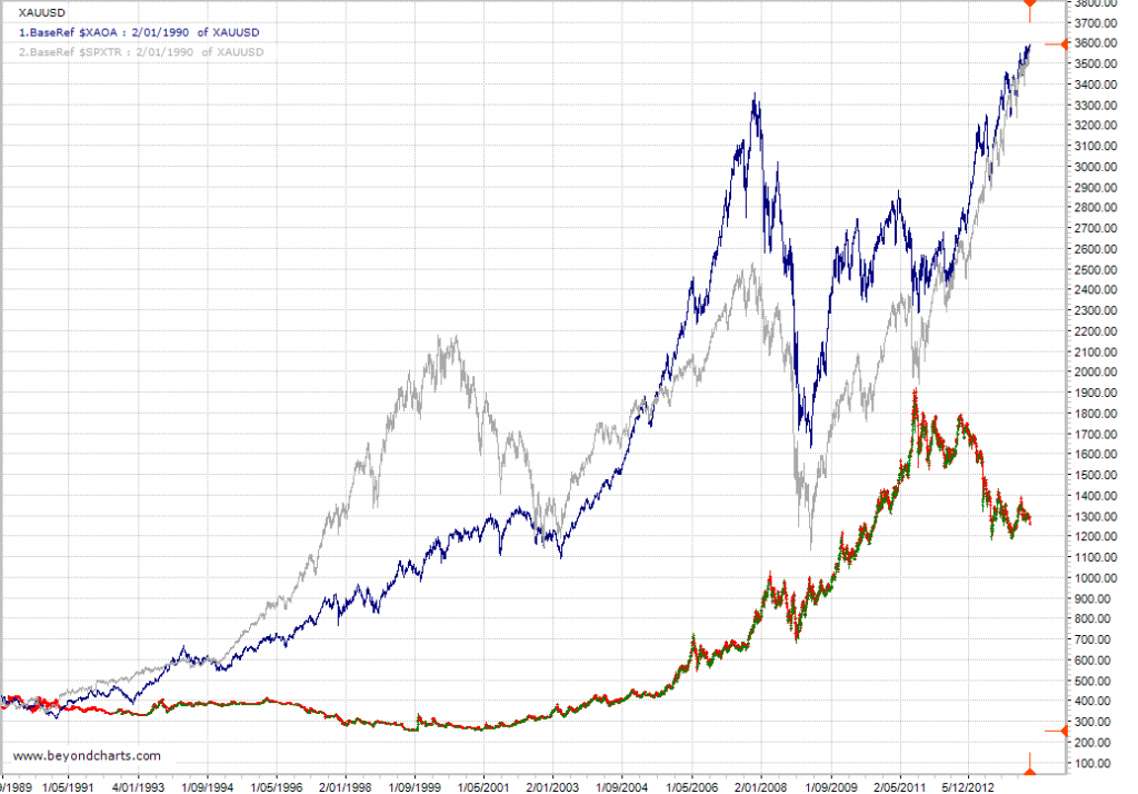
The chart below shows a near 25 year period from January 1990 to the present day. This chart compares the long term performance of both the ASX All Ordinaries Accumulation Index and the S&P500 Total Return Index to the gold price in USD. This time frame encompasses a wide range of global events that have had dramatic impact on global share markets including the World Trade Centre attacks, the 2003 -2007 bull market, the Global Financial Crisis, and a host of others.
These charts represent a ‘buy and hold’ strategy of the overall index, including all dividends. This could involve buying a basket of stocks that mirrors the components of the index, buying an index fund or an ETF that replicates stocks held in the index.
The red/green chart is the gold price in USD, the upper blue line is the All Ords Accumulation Index and the grey line is the S&P500 Total Return Index.
Both the S&P Total Return Index and the All Ords Accumulation Index have been clear outperformers over this 25 year period, never once having underperformed the gold price the whole time, including during the GFC!!
Both of these indexes include dividend returns. As well as holding stocks for capital growth, shareholders also received dividends on their holdings over this 25 year period. A holding of gold bullion or futures contracts attracts NO dividend return. It is essentially the same as holding onto a vacant block of land with a long term view that it will increase in value, but not receiving any rent!
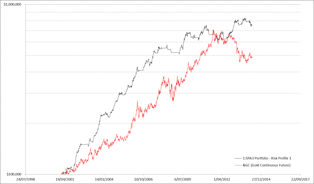
Now, let’s take a look at the performance of an actively managed share portfolio compared to the price of gold, as opposed to a simple buy and hold share investing strategy. The chart below shows the performance of the publicly traded SPA3 portfolio compared to the gold price over the length of the SPA3 public portfolio or 13.4 years.
Since the inception of the public portfolio in 2001, SPA3 has consistently outperformed the price of gold, apart from a few wobbles in late 2010, early 2011. Admittedly, this chart does represent a ‘buy and hold’ position in gold vs an actively managed share portfolio – taking all buy and sell orders according to the rules, and reverting to cash during periods of high market risk. But, that is the whole point. Holding onto gold as an inflation hedge and a wealth protection strategy is exactly what the ‘gold bugs’ advocate. Clearly, an actively managed share portfolio is the clear winner as both a hedge against inflation and as a wealth creation strategy.


