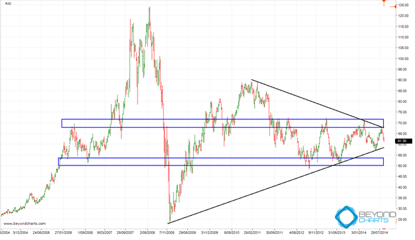
At $26.7 billion Rio Tinto (ASX: RIO) clocks in at Australia’s 11th largest listed company. RIO is also listed on the LSE and NYSE with its mining assets spread across the globe. RIO’s share price suffered enormously during the 2008 bear market falling from an adjusted high of just under $125 (pre a share split it nearly reached $160) to a low of $23.59 and has recovered around 38% of that fall.
RIO Chart
The ten year weekly chart below shows the formation of a long-term symmetrical triangle where RIO’s share price has experienced lower highs and higher lows, depicted by the black trend lines. Typically lower highs are bearish and higher lows are bullish. Which will win out? The bearish lower highs, or the bullish higher lows? Technically, when a symmetrical triangle forms, a breakout occurs when the triangle starts nearing its apex. That time is nearing and may occur any time from now to about two or so months from now.
The question is in which direction will the breakout occur? With symmetrical triangles the odds are in favor of the next directional move being in the same direction as the one in control when the triangle started forming, that is, a symmetrical triangle is typically a continuation pattern. With long-term symmetrical triangles the prior direction is not always clear, as is the case with RIO. Cases could be put forward for both but I would lean towards it having been down.

Source: Beyond Charts
Broadening our analysis to further clarify the situation, there are two major support and resistance zones that have formed over the last eight years, the two blue horizontal rectangles in the chart above. When the breakout does occur it is likely that either of these two zones will support, from below, or resist, from above, the next share price move. The next long-term directional move may only really be known when a clear breakout has occurred out of either of these two zones.
How does the Iron Ore price affect RIO’s share price?
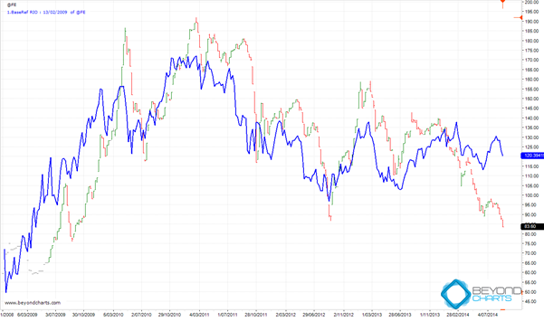
Extending our analysis again seeking more clarification I have turned to a base comparison with the iron ore price. The weekly chart below is based from February 2009. The blue line is RIO’s share price movement and the bar chart that of the iron ore price.

Source: Beyond Charts
I’m sure that the close correlation between the two in shape and direction needs no pointing out. There is a discrepancy that exists between RIO and iron ore right now. The odds are that the RIO share price will follow the iron ore price which would mean a fall that would most probably cause RIO’s share price to breakout out on the downside. In the first chart above, this would mean a break below both the lower trend line of the symmetrical triangle and the lower blue horizontal support zone. Will RIO be able to swim against the iron ore tide or will its share price be locked into the ebb and flow of the iron ore price?
There are no guarantees in the this wonderful world of investing as there are always more variables at play than any one of us can compute at any one given time. There are only probabilities. Whilst the probabilities are for a fall in the RIO share price, any other variable could pop to the fore and have a bigger effect than those discussed above. Therefore, while RIO resolves its price oscillation, it would be prudent to wait for the next directional move to take place before deciding what action to take.
Gary Stone is the Founder and Managing Director of Share Wealth Systems.
